Design systems
Design Systems help to create a common language between designers, developers, and other stakeholders. Documenting design decisions will help keep your team aligned even if you cannot maintain a formal design system.
Components
Components should be documented in many different ways. Normally designers start with defining visual design and behavior, but general rules on how a component should be used is just as important. Component usage documentation should also consider accessibility and localization implications.
Design guidelines
Just as important as documenting components is defining core visual design rules. This can be core design basics such as typography, color, and spacing, but should also consider things like page layout, empty state, animation patterns, and other common patterns. Core design basics, or “tokens”, are usually defined early on in the creation of a design system since they are the building blocks to the rest of the elements of the design system.
Accessibility
Inclusive design is a must in product design. No user should be left out because of a disability. When building a design system, accessibility must be considered. An example is always providing a visible label on form elements. Usually code components are built with safety nets to prevent this from happening, but if you are properly documenting these accessibility guidelines, then that should help educate your designers and developers to help avoid such mistakes.
A peek into my design system contributions
iCIMS Design System
The iCIMS Design System is very mature. Our components are maintained in a single Figma file. Established and upcoming design patterns are also defined in Figma. This allows all designers to easily contribute. Using Figma for maintaining our design system’s design assets has become crucial now that it supports branching. At any time, a designer can make a branch of the design system and submit their contribution for review!
From a code perspective, Storybook contains all the code examples we have for the developers to reference. And then, we use Zeroheight to bring all of the documentation together in one place. The Zeroheight site is the main iCIMS Design System reference for developers, designers, and any other users of the design system.

iCIMS Design System file in Figma
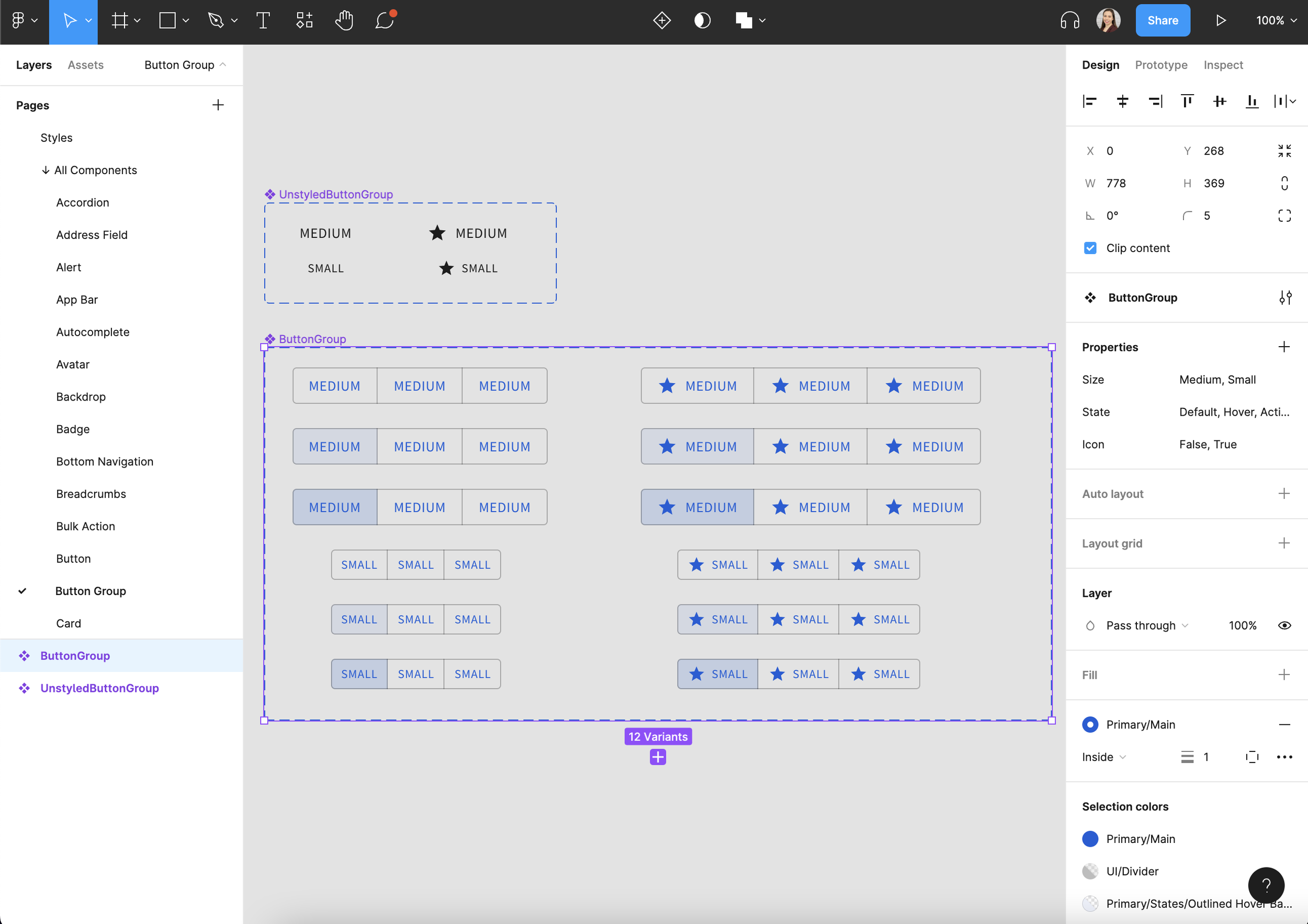
ButtonGroup component in iCIMS Design System file in Figma
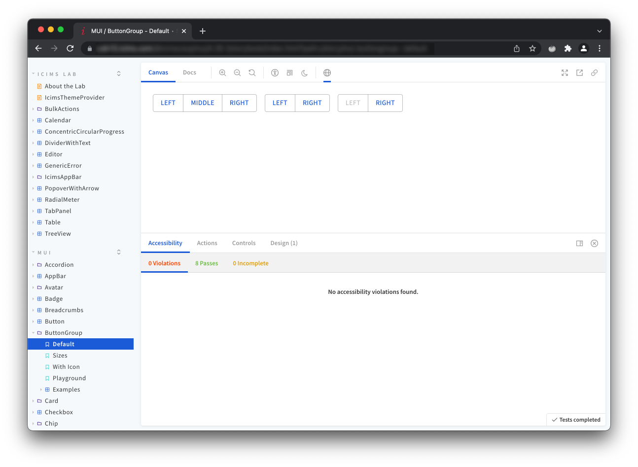
ButtonGroup component - iCIMS Component Library in Storybook

ButtonGroup documentation - iCIMS Design System Site (zeroheight)

Text color tokens accessibility (a11y) assessment
iCIMS Design System case studies
Progressive disclosure pattern (To view this case study, please enter the password "ladybug".)
CentralReach Design System
During my short time at CentralReach, we started to form a design system. The junior UI designer and I maintained a component library in Sketch that was available for all in Zeplin. It was based off of the React MUI library. I would develop and maintain any style overrides to the theme so that the developers didn’t have to worry about the styling the components themselves.
See below for some examples of Storybook, Zeplin, and Confluence component documentation.

Checkbox component library documentation 1 of 3

Checkbox component library documentation 2 of 3

Checkbox component library documentation 3 of 3

Select component visual design states from Zeplin

Modal pattern - informal documentation of design decisions

Breakpoints documentation