Revisiting the Paper component

PROBLEM:
While reviewing the Paper component during the iCIMS Design System cleanup project, a fundamental and simple styling error was exposed.
The paper background color correction
Overview
A key part of the design system cleanup was ensuring that component defaults aligned with both design specifications and the underlying Material UI (MUI) theme. This uncovered an important discrepancy in the Paper component—a foundational container element.
Issue discovered
While the two existing Figma files were essentially in alignment regarding the structure of the Paper component, a fundamental styling error was present in file #1 and Storybook:
The Problem: The Paper component was incorrectly using the generic
Background/Defaultcolor token for its fill.The Intention: Based on Material Design principles and our specific theme, the Paper component is meant to appear as a distinct layer on top of the main UI background, and should therefore use the
Background/Papertoken, which is typically a white or a light off-white.
This default color error was significant because the Paper component is used to house content, cards, and dialogue boxes. Using the generic background color made it indistinguishable from the main canvas, which lead to poor visual hierarchy and confusion from designers regarding the incorrect color usage.
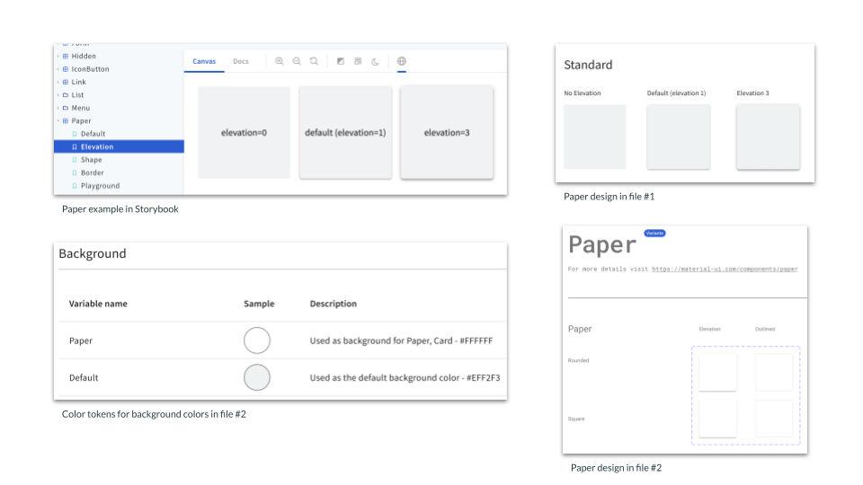
The Paper component used Background/Default in Storybook and file #1, while file #2 correctly had the background as Background/Paper.
My contribution
My work focused on correcting this core token assignment:
Diagnosis: I confirmed that the Paper component in the Figma file was pulling the wrong color token.
Correction: I updated the component's fill to use the
Background/Papercolor token, establishing the correct white background as its default state.Code Alignment: To finalize the fix, I created a Jira ticket for the Design System Engineering (DSE) team to update the Paper component's background color in the code (Style Dictionary/MUI theme) to align with the corrected color token used in the Paper component in Figma.
Outcome
By correcting this single default styling in the Paper component, we instantly improved the component's visual role, restored proper hierarchy, and eliminated a key point of confusion and friction for the designers.
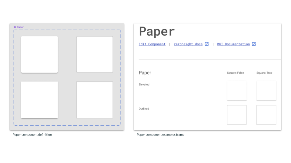
Paper component and examples in the updated DS file using the correct background color. Shortly after, the code base was updated to use the correct color.