Revisiting and aligning design system color tokens

PROBLEM:
At the time of the iCIMS Design System cleanup project, the color tokens had never gone through an official review of two things:
Compliance with WCAG color contrast requirements on our background colors
Alignment audit of color tokens between design and development
Addressing accessibility: WCAG color contrast
Goal
Achieve a minimum of WCAG AA color contrast standards (4.5:1 ratio) for text against backgrounds, and to aim for WCAG AAA (7:1 ratio) for primary and secondary text colors against common background colors.
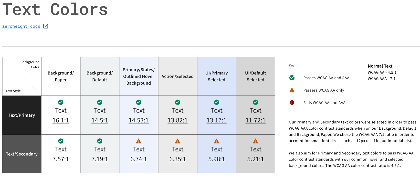
Table showing the contrast ratios for Text/Primary and Text/Secondary color values against various background colors, including Background/Paper, Background/Default, and different selected/hover states.
Issues discovered
Initial contrast checks revealed that some color combinations, particularly those for secondary text and various UI states (like outlined hover and selected states), either failed WCAG both AA and AAA or only passed WCAG AA but not AAA. This included ratios as low as 5.21:1 for secondary text on a UI/Default Selected background.
My contribution
I was directly involved in the Color token updates, working to adjust colors to pass the minimum of 4.5:1 contrast ratio. For example, I determined Text/Secondary color token needed to be updated from black with 54% opacity to 67% opacity. This ensured that the updated color used for secondary text would help support accessibility in our products.
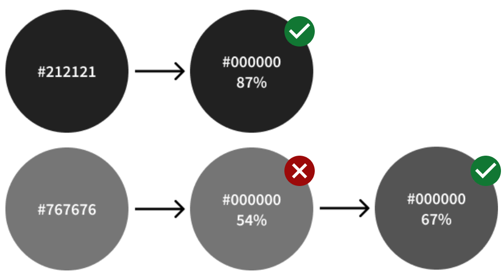
The Text/Primary color token remained unchanged, but the existing Text/Secondary color needed to be updated due to a low contrast ratio.
Token alignment: Unifying design and code
Project goal
Resolve discrepancies between the color tokens in the deprecated Figma files and the production-ready tokens used in the code base.
Issues discovered
One of the deprecated files had Primary color tokens that did not align with the Material UI (MUI) theme structure. Similarly, the other file was published before its style tokens were updated. This inconsistency led to confusion and a lack of trust in the design files.

Primary tokens in both files. File #1 did not have a proper mapping with MUI theme format.
My contribution
As part of the cleanup plan, a fresh MUI Template file was adopted , and a priority was placed on updating the Color & Typography tokens to align with the MUI theme structure and the iCIMS theme colors.
This involved reviewing the existing color token definitions for Primary and Background colors.
For the Paper component, my cleanup work included creating an engineering ticket to update the background color in the code to align with the new Figma design.
This effort resulted in a more cohesive and accurate design system Figma file. It also led to more color tokens being added to the Style Dictionary and the creation of Jira tickets for the Design System Engineering (DSE) team for any style tokens in need of alignment with the Figma file.
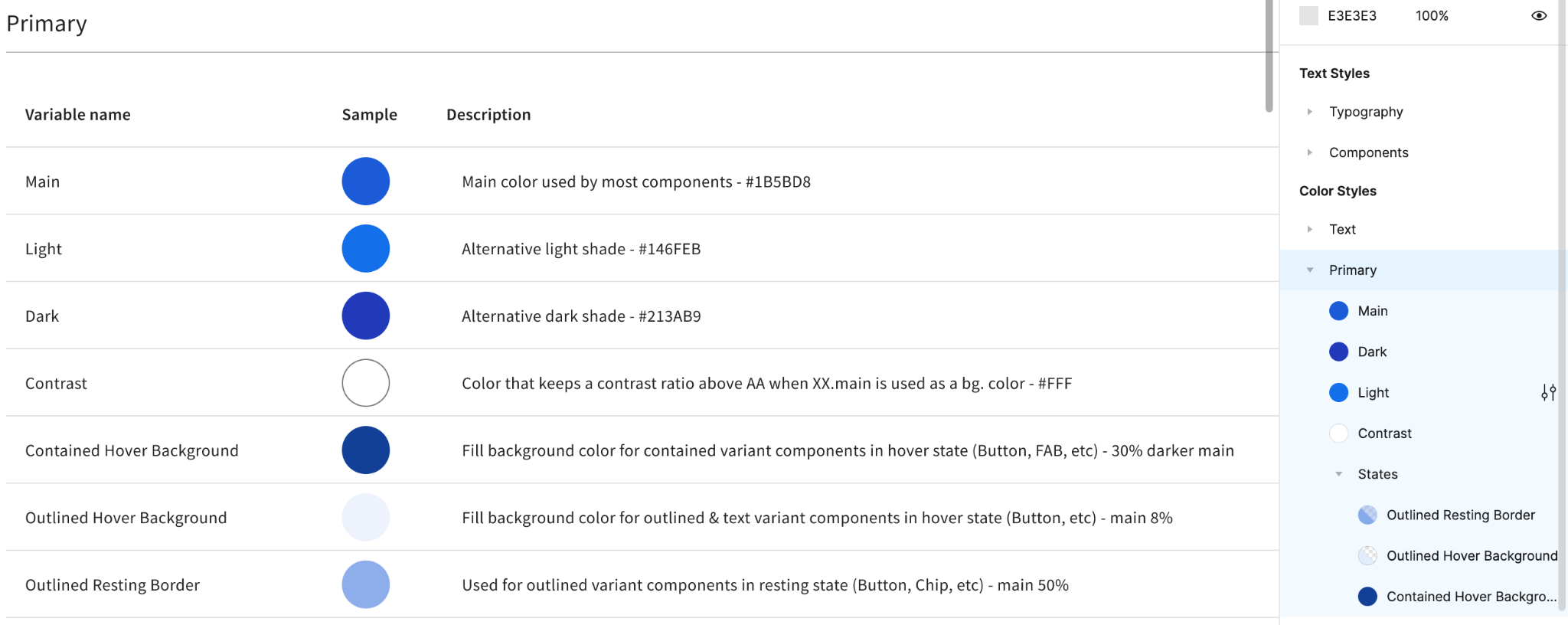
Primary tokens as documented and color styles in the new DS Figma file.