Revisiting the Button component

PROBLEM:
While reviewing the Button component during the iCIMS Design System cleanup project, it was clear the existing implementations were underutilizing component features in Figma and included unnecessary variant causing designer confusion.
The button component cleanup
Overview
As one of the most frequently used component in the design system, the Button was a top priority for cleanup. It served as a critical case study for addressing component redundancy, managing variant usage, and ensuring the component in Figma was both efficient for designers and fully aligned with code.
Issues discovered
Outside of the two existing Figma files having differing visual styles of the Button component, the implementations themselves were also fragmented:
File #2 - Bloated and cluttered: This file included Button variants that were not supported or used in our design system code implementation. While these unused variants (secondary colored button) were visually blocked out, they were not actually removed from the Figma component's properties, cluttering the design panel and requiring designers to look at the component file directly to know what not to use.
File #1 - Styling mismatch and missing variants: The Button component in this file did not have a consistent design for the Button component but it also wasn’t complete. This showed a complete deviation from Material UI (MUI) component structure which cause confusion for both designers and developers.
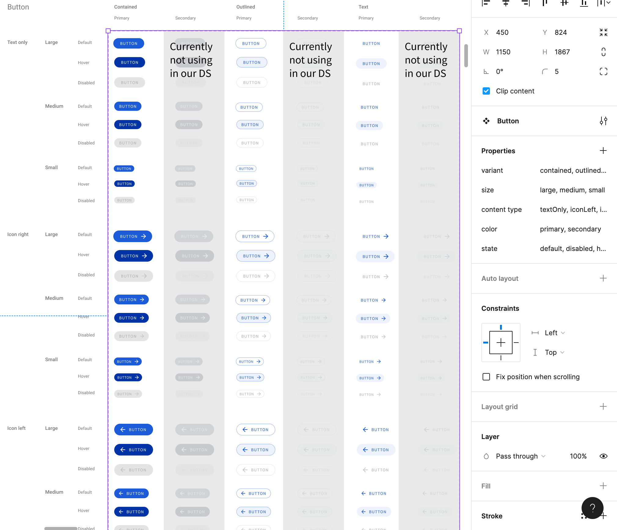
In file #2, all of the secondary button variants are visually blocked out, but the color variant still included “secondary” as an available option.
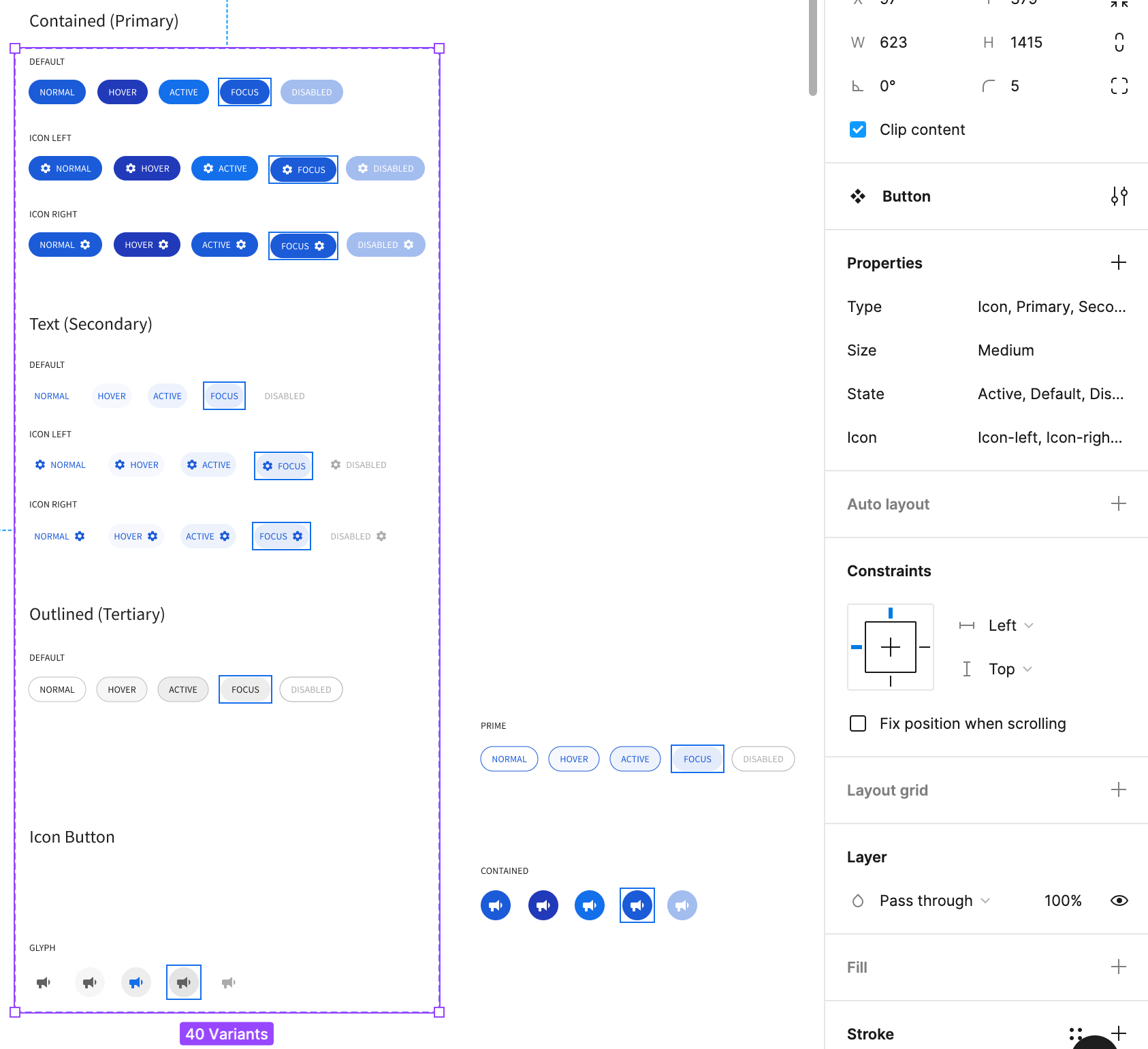
In file #1, the outlined button was styled gray instead of blue. Also, the outlined button had missing variants.
The cleanup
In partnership with a designer, we updated the Button component in the new DS Figma file with the following in consideration:
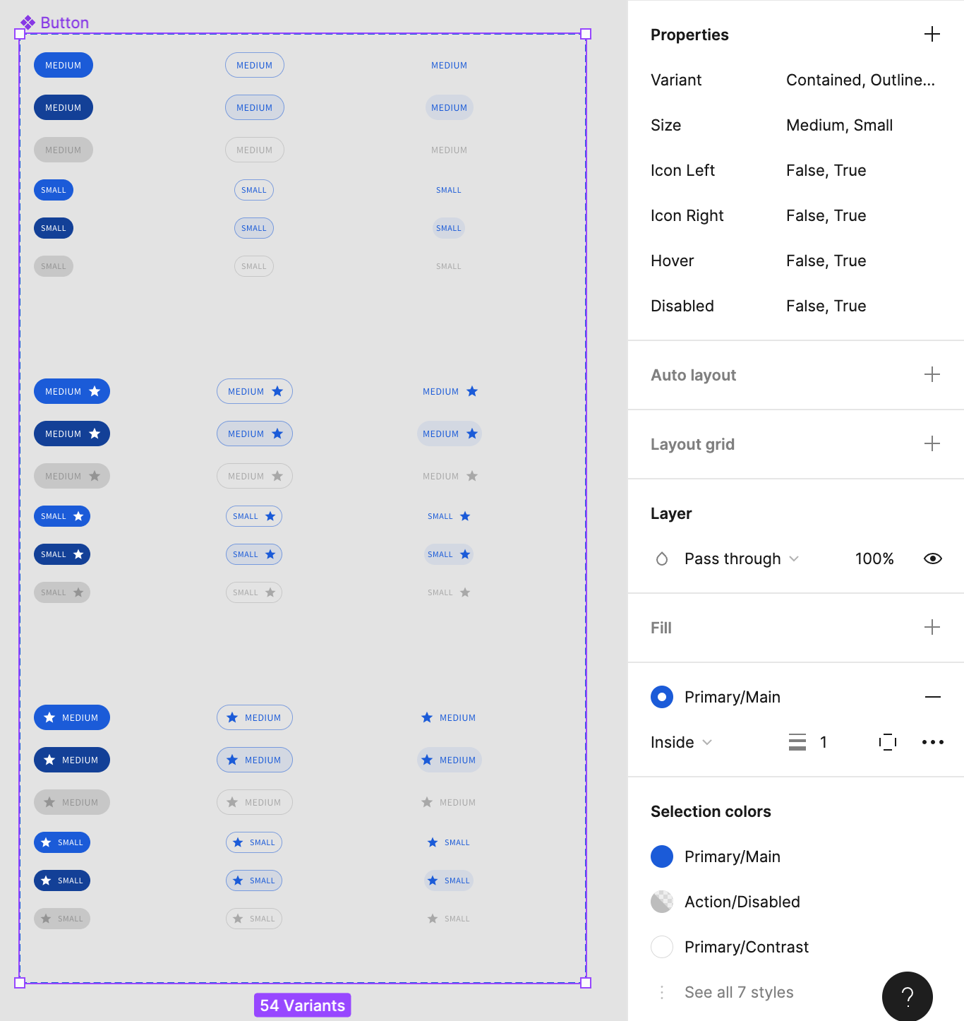
Strict Pruning of Variants: We made the easy but necessary decision to remove all unused Button variants from the component's properties in the new file. This immediately simplified intended usage of the component for all designers.
Size Standardization: We deliberately maintained a simple complexity model by supporting only two button sizes—Medium (Default) and Small. The team determined that the Large size was too big for our application layouts. The choice between Default and Small allowed us to distinguish between primary page actions and smaller, context-specific actions.
Reorganizing with Figma Variants: The designer made sure the updated Button component followed MUI’s property structure. This allowed us to organize all supported states (
Normal,Hover,Disabled) and types (Contained,Outlined,Text) into a cleaner property panel. This saved designers significant time and reduced the margin for error when choosing a Button style.
Outcome
By standardizing sizes, removing bloat, and leveraging Figma's variant features, the new Button component became intuitive, reliable, and perfectly aligned with the design system code library, helping to restore both designers’ and developers’ trust in the design system.
The updated DS Figma file with better organized properties and re-aligned styling. The Icon Button was also moved to it’s own component for easier discovery.